One of the most exquisite and intricately structured scripts still in use today is Devanagari. Hundreds of millions of people speak Hindi, Marathi, Sanskrit, Nepali, and many other languages powered by it. However, Devanagari isn’t typically given the same attention as Latin letters when it comes to typography. Publishers, designers, and content producers frequently use the typeface that came with their tools by default, which can progressively compromise readability, accessibility, and brand identity.
Selecting the appropriate Devanagari font involves more than just esthetics. It has an impact on a publication’s professional appearance, how easily readers can scan a page, and how effectively text renders on various platforms and formats. This helpful advice will assist you in making a decision.
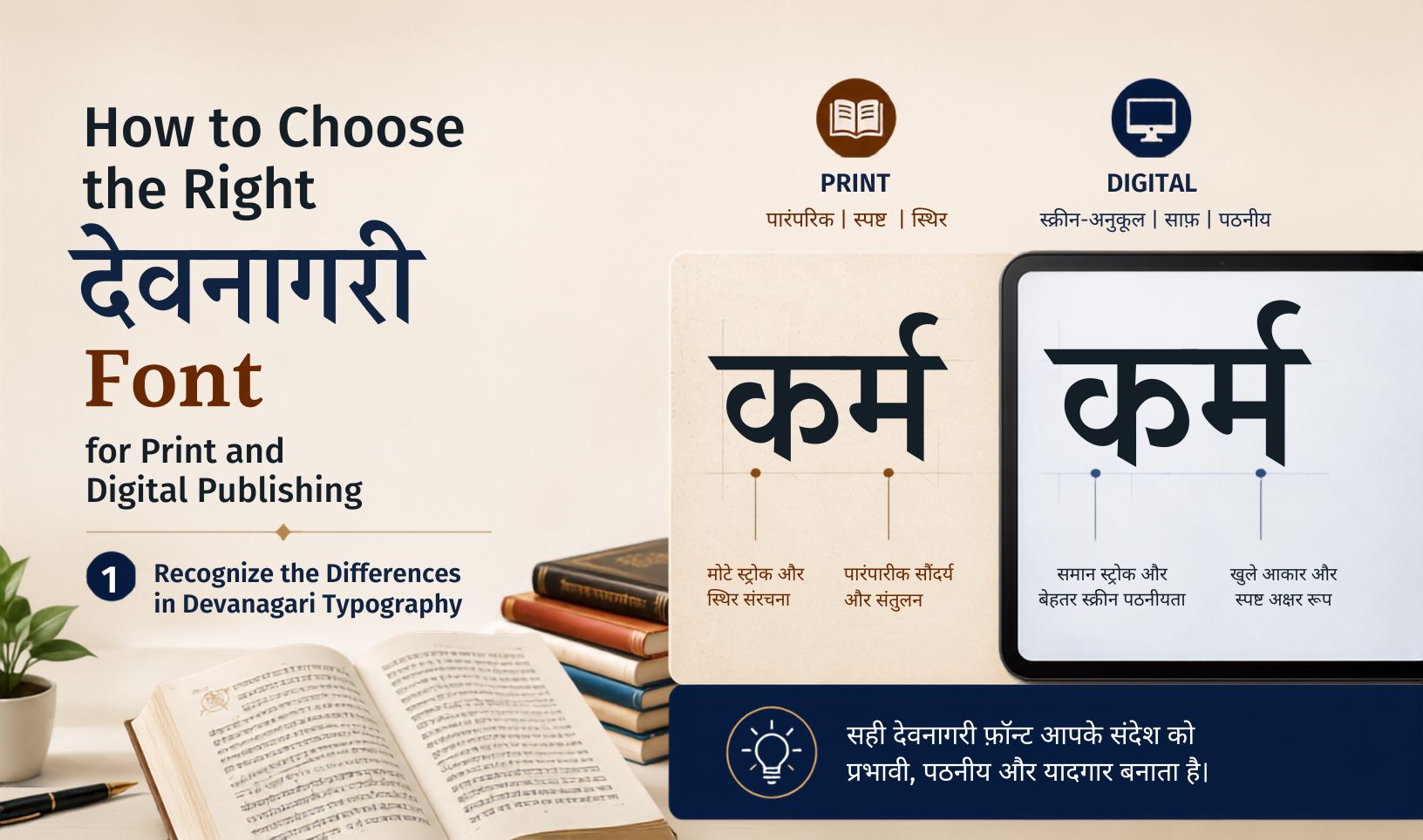
1. Recognize the Differences in Devanagari Typography
It’s helpful to know what you’re really analyzing before comparing fonts. There are characteristics of Devanagari that are absent from Latin scripts:
- The shirorekha (headline): The horizontal line that crosses the top of the majority of characters is called the shirorekha, or headline. Visual rhythm of a page can be made or broken by its thickness and uniformity within a font family
- Conjunct consonants (ligatures): Two or more consonants are often combined into a single glyph in Devanagari. Whether these seem as graceful, accurate forms or awkward piled approximations depends on the conjunct support of a typeface.
- Vertical stress vs. horizontal stress: Devanagari reading rhythm is largely dependent on the horizontal headline, in contrast to Latin type, which frequently has strong vertical stems. At small sizes, fonts that don’t handle this properly may feel unsteady.
Understanding these principles provides you with a vocabulary for evaluating quality that goes beyond “this looks nice.”
2. Match the Font to the Medium
Print and digital have different technical demands, and a font that shines in one can struggle in the other.
For print:
- Prioritize fonts with well-designed serif-like detailing (if the style calls for it) and consistent stroke contrast — these hold up well in offset printing.
- Examine the font’s performance not just at 100 zooms on screen, but also at your actual print size. If the font was not created with print in mind, Devanagari conjuncts may become unreadable below a specific point size.
- Since print cannot tolerate the same rendering shortcuts that screens do, look for high-resolution hinting or at the very least crisp vector outlines.
For digital:
- Screen rendering depends heavily on hinting and how the font behaves at different pixel densities. A font that looks great in a PDF may look muddy on a low-DPI Android device.
- Web fonts need to be optimized for file size without losing conjunct and matra accuracy. Here, variable fonts are becoming more and more helpful, enabling you to deliver a single file that adjusts to different weights.
- Because rendering engines interpret hinting differently, test the font in the real-world context it will be used in, such as a browser, e-reader, or mobile application.
If your project spans both mediums, look for type families explicitly designed for cross-media use, or budget for licensing two optimized variants.
3. Prioritize Full Unicode and Conjunct Coverage
Many free or packaged fonts are inadequate in this regard. A font may appear full in a demo but fail on actual text because it uses unsightly half-form stacking or lacks the appropriate glyphs for less common conjuncts (like ज्ञ, क्ष, or त्र)
Before committing to a font:
- Test it against a real paragraph of your actual content, not just a sample sentence.
- Include edge cases: technical or literary text tends to surface conjuncts that everyday text doesn’t.
- Check Unicode compliance explicitly — this matters for search indexing, accessibility tools, and copy-paste behavior across platforms.
4. Evaluate Readability at Body Text Sizes
A font that looks striking as a headline may be exhausting to read in a 300-word paragraph. For body text:
- Look for consistent x-height (or the Devanagari equivalent — the space below the headline) so text doesn’t feel cramped.
- Check letter spacing and word spacing at your intended size. Devanagari’s headline can create a visual “solid block” effect if spacing is too tight.
- Test on the actual background and paper stock (or screen brightness) you’ll use, since contrast affects perceived readability more than font choice alone.
For long-form content — books, articles, reports — legibility should outrank personality. Save distinctive, high-personality fonts for headlines and branding elements.
5. Check the Full Weight and Style Family
A single regular-weight font isn’t enough for professional publishing. Look for:
- Multiple weights (light, regular, medium, bold, black) for hierarchy in headings, subheadings, and emphasis.
- Italic or oblique styles, if your content needs them — these are less common and less refined in Devanagari type, so test carefully.
- Numeral support, both Devanagari numerals and Latin numerals if your content mixes them, which is common in dates, prices, and technical text.
A well-rounded family gives you design flexibility without having to mix fonts from different foundries, which often creates visual inconsistency.
6. Consider Licensing and Format Requirements
Technical fit matters as much as visual fit:
- Print: You’ll typically need OpenType (.otf) or TrueType (.ttf) files with proper embedding permissions for your design software and printer.
- Web/digital: You’ll need WOFF/WOFF2 formats with a license that explicitly covers web embedding — not all desktop font licenses do.
- App/e-reader use: Some platforms require specific licensing tiers for embedding fonts inside apps or e-books.
Always check the license terms before finalizing a font, especially for commercial publishing.
7. Test with Real Native Readers
Automated checks and visual inspection can only go so far. If possible, have native readers review sample pages. They’ll often catch issues that aren’t obvious to non-native eyes — awkward conjunct rendering, unnatural spacing, or a font that “feels” foreign in tone even if it’s technically correct.
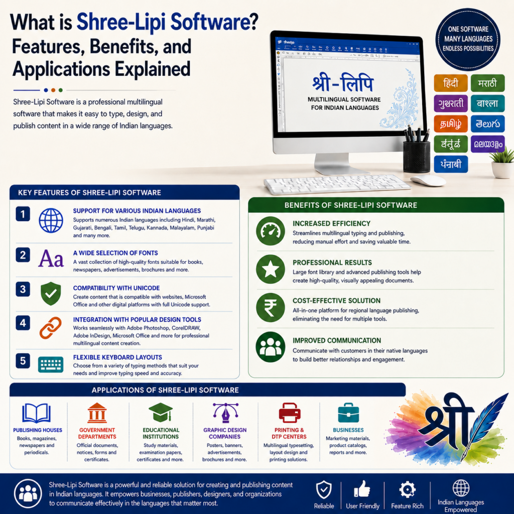
A Few Reliable Starting Point is ShreeLipi Unicode fonts / customized unicode fonts:
- SHREE_DEV_OTF fonts — Clean, modern, popular for web and UI work. Strong Unicode coverage, reliable for digital use.
Final Thoughts If you want professional, readable results, selecting a Devanagari font takes more than five minutes. It necessitates comprehending the particular structural requirements of the screenplay, aligning technological specifications with your medium, and conducting extensive testing with actual material and readers. Good Devanagari typography makes your work really easier and more enjoyable to read, which is the whole objective of publishing in the first place, so the extra effort pays off.